
THE PROCESS
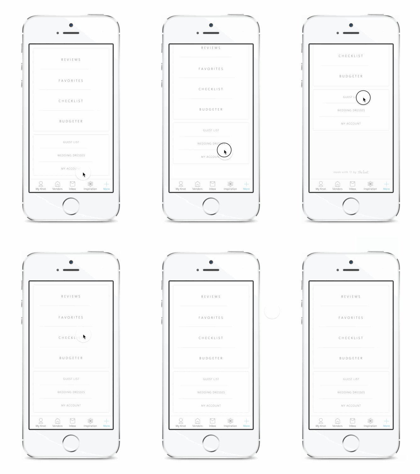
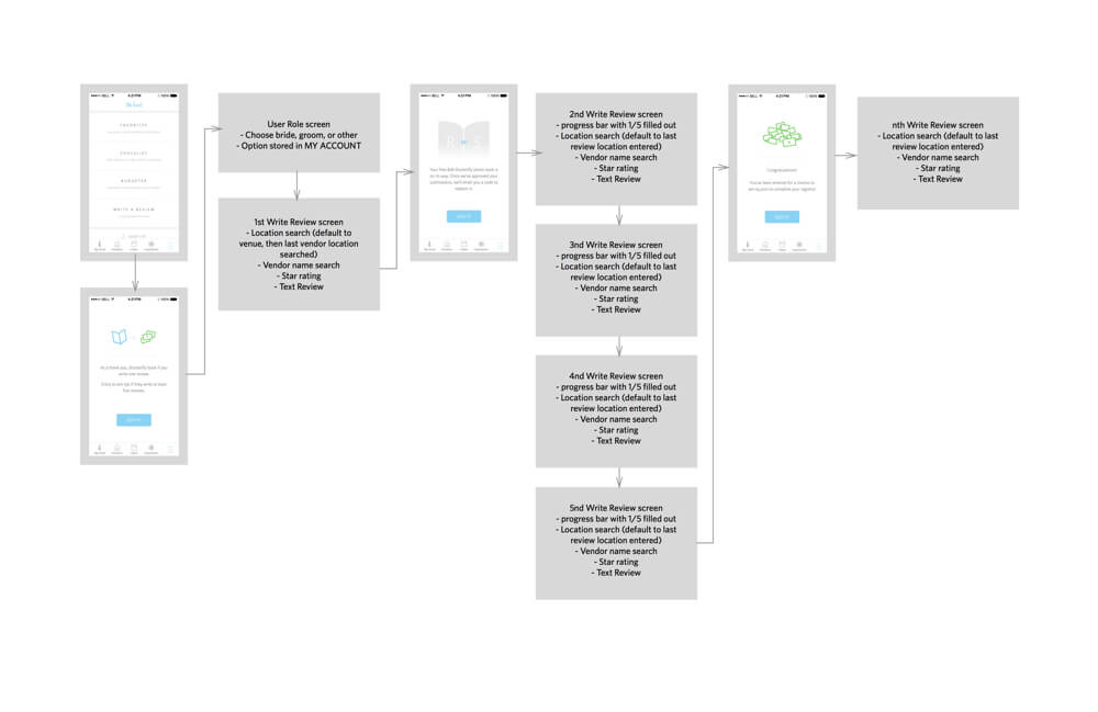
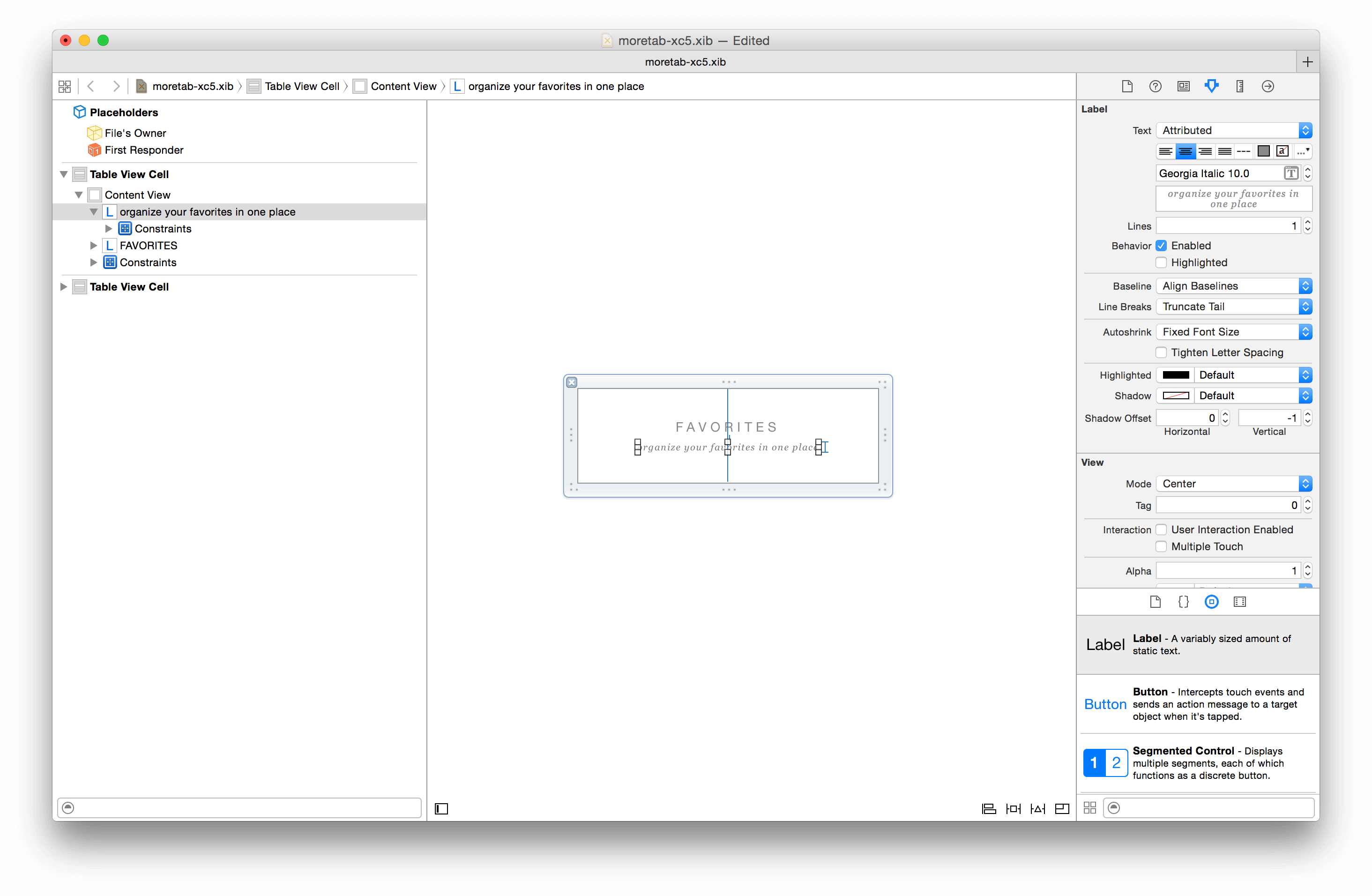
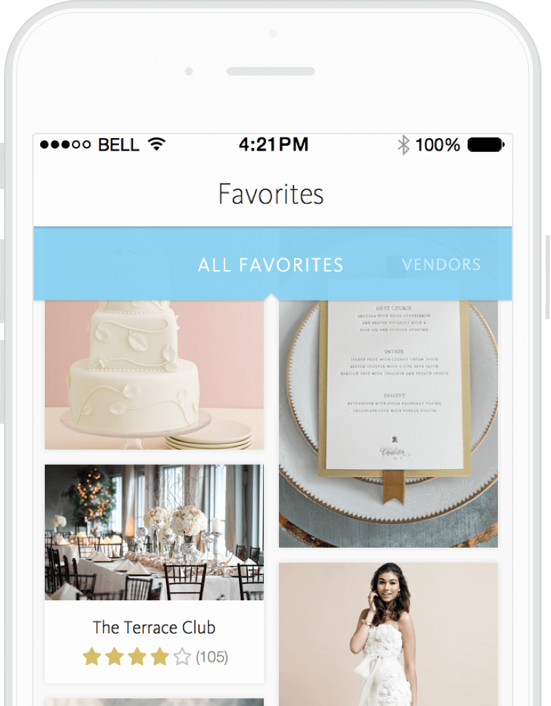
For all features, we started off in the ideation stage and quickly focused our ideas through sitemaps and wireframes. Prototyping also helped communicate animations and transitions. We also set up a system to style storyboards, freeing the developers up to chug through other work while leaving me to dig into the UI. More details on this workflow can be found in this talk we gave to the iOS Developers Meetup group.

THE RESULT
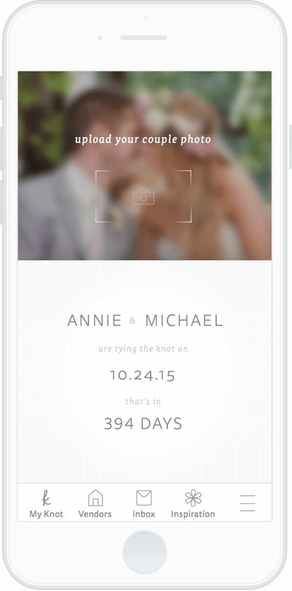
For most stories, final comps were made, specced out, and delivered to the devs. Working closely with them and learning how to make my specs work best for that (e.g. when line heights don’t match or they need constraints instead of absolute positioning) always resulted in the best work. I also created all of our native app icons to co-exist as a branded suite.
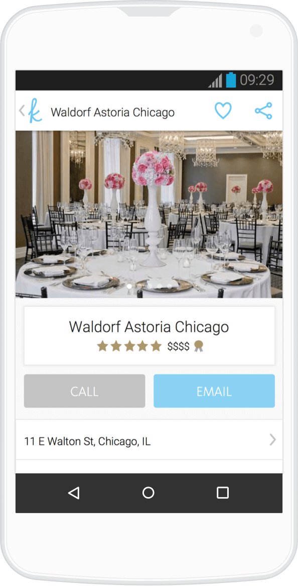

ANDROID
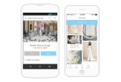
When it came time to quickly translate this design for Android, I took the opportunity to familiarized myself with native design patterns and figured out how to make this the best possible native experience.
After a couple rounds of iteration and user testing, we saw that the work put into leveraging native design patterns paid off. The main user journeys become nearly frictionless, and our growing Android user base rewarded us with great reviews.
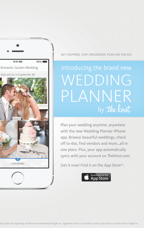

GREAT SUCCESS!
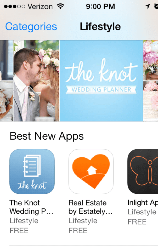
The relaunch was a huge success and Planner App continues to be iterated upon. The App Store featured our app and we won a min Award. Since launch, we’ve consistently ranked #1 for "wedding planner” and maintained a 4+ star rating.
